

Published September 24, 2026
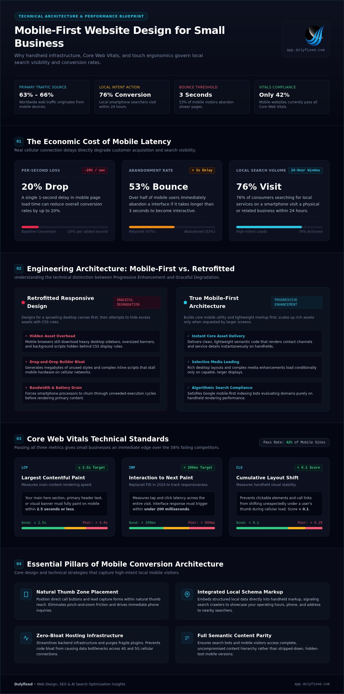
Shrinking a desktop layout down to fit a smartphone screen isn't mobile optimization; it's a quiet way to lose local leads every single day. True mobile-first website design for small business treats mobile architecture as your primary lead engine, not an afterthought. When 53% of mobile visitors abandon pages that take more than three seconds to load, bloated templates and broken touch menus directly hurt your bottom line.
You already know how frustrating it feels to watch hard-earned traffic bounce because a desktop theme refuses to cooperate on cellular connections. You shouldn't have to battle fragile plugins or clunky forms just to secure a phone call. In this guide, you'll discover how mobile-first architecture drives local visibility, lowers bounce rates, and converts mobile traffic into paying customers. We'll examine the technical performance standards, Core Web Vitals targets, and clean layout strategies you need to turn casual phone searches into booked revenue.
Key Takeaways
- Effective mobile-first website design for small business prioritizes core utility, lightning-fast delivery, and direct contact options on handheld screens before expanding to desktop layouts.
- Search engines judge your site exclusively by its mobile performance, making strict Core Web Vitals targets like Interaction to Next Paint critical for organic visibility.
- Designing touch-friendly call buttons and lead capture forms within the natural thumb zone eliminates friction and increases immediate phone inquiries.
- Integrating local schema markup directly into your mobile architecture signals search engines to showcase your business to nearby, high-intent searchers.
- Auditing real cellular connection speeds and switching to streamlined hosting infrastructure keeps pages lightweight and prevents traffic loss caused by code bloat.
Table of Contents
- What Is Mobile-First Website Design for Small Business?
- Why Mobile Site Performance Directly Governs Search Rankings
- Essential Anatomy of a High-Converting Mobile Web Layout
- Connecting Mobile Layouts to Local Search and Business Automation
- Executing Your Mobile-First Strategy Without Technical Bloat
What Is Mobile-First Website Design for Small Business?
Mobile-first website design for small business is an engineering practice that builds the digital experience for smartphone screens before creating the desktop version. Instead of designing a sprawling desktop canvas and attempting to shrink it down later, this approach prioritizes essential content, rapid delivery, and core utility from day one. Smartphone users rarely browse like office workers at dual-monitor desks. They need direct answers, readable text, and immediate contact touchpoints without pinching, zooming, or waiting on heavy graphics to load.
Mobile-First Architecture vs. Retrofitted Responsive Design
Many drag-and-drop website builders promote automated scaling, but shrinking a heavy layout creates invisible drag. Responsive web design frequently relies on graceful degradation, hiding complex desktop sidebars, oversized banners, and background scripts behind CSS display rules. The problem? Mobile browsers still download and process those hidden assets across wireless networks, draining battery life and choking limited bandwidth.
True mobile-first architecture relies on progressive enhancement instead. You begin with clean, lightweight markup and core assets that load instantly on handheld devices. Rich media and desktop layout adjustments are added only when larger screens request them. This approach keeps codebases lean, speeds up rendering, and prevents mobile data bottlenecks.
The Economic Impact of Mobile Visitors on Local Revenue
Your mobile layout functions as your primary cash register, not a secondary display. With mobile devices generating between 63% and 66% of worldwide web traffic, a sluggish interface directly erodes small business revenue. The local stakes are even higher: 76% of consumers who run a local smartphone search visit a related business within 24 hours.
Speed directly influences consumer trust and conversion:
- Conversion loss: A single one-second delay in mobile page load time can reduce conversions by up to 20%.
- Customer bounce: If your mobile interface takes longer than three seconds to become interactive, over half of your visitors will leave.
- Lost local revenue: High bounce rates send immediate signals to search engines that your site fails user intent, pushing local visibility toward competitors.
Adopting mobile-first website design for small business ensures your phone number, location, and key services load immediately, capturing high-intent prospects before they bounce.
Why Mobile Site Performance Directly Governs Search Rankings
Google evaluates your web presence entirely through your mobile footprint. Desktop performance metrics are no longer a fallback. In fact, full implementation of mobile-first indexing means automated crawlers rank your domain based purely on how clean, fast, and structured your phone interface is. If your mobile layout stumbles on basic phone hardware, your search visibility drops across all devices.
Most DIY drag-and-drop page builders load megabytes of unused scripts, bloated stylesheets, and complex inline styles. While modern desktop computers can brute-force their way through this mess, mid-range smartphones running on cellular connections quickly stall out. Clean semantic markup loads instantly, whereas builder bloat forces mobile processors to churn through unnecessary script execution before painting a single sentence.
Decoding Core Web Vitals for Non-Technical Business Owners
Search algorithms measure user interaction through Core Web Vitals, and only 42% of mobile websites currently pass all three benchmarks. Getting these three technical metrics into the green gives you an immediate operational edge:
- Largest Contentful Paint (LCP): Measures loading speed. Your main hero section, text, or primary visual must render in 2.5 seconds or less.
- Interaction to Next Paint (INP): Tracks interface responsiveness. Replaced First Input Delay in 2024 to measure tap and click latency across the entire visit. Good performance requires response times under 200 milliseconds.
- Cumulative Layout Shift (CLS): Measures visual stability. Keep this score under 0.1 so buttons and phone links do not suddenly shift under a user's thumb while browsing.
Mobile-First Indexing and Semantic Content Hierarchy
Modern mobile-first website design for small business requires content parity. Search bots do not view hidden content favorably. If you strip key service descriptions or customer reviews out of your mobile view just to save visual space, Google treats that data as nonexistent.
Nesting your content with proper semantic tags helps both Google bots and AI discovery engines extract direct answers for local searchers. Clear headings, concise copy blocks, and structured FAQs allow search engines to summarize your services accurately. If your current mobile layout feels slow or clunky under real cell conditions, you can reach out to Dulyfixed to assess where technical bottlenecks are draining your organic traffic.
Essential Anatomy of a High-Converting Mobile Web Layout
High-performing mobile screens don't happen by accident; they follow intentional structural blueprints designed around human fingers and small viewports. When executing mobile-first website design for small business, conversion rates depend on eliminating physical and visual friction across four practical steps:
- Step 1: Anchor primary contact options and your core value proposition above the fold.
- Step 2: Map interactive buttons inside the natural arc of the user thumb zone.
- Step 3: Strip away decorative widgets in favor of clean, high-contrast typography.
- Step 4: Trim initial inquiry forms down to three essential customer inputs.
Ergonomic Thumb Zones and Click-to-Call Accessibility
Modern smartphone screens span viewports between 360 and 430 pixels wide, making top corners difficult to reach during one-handed use. Position critical actions, like quote requests and phone links, within the lower third of the viewport where thumbs rest naturally. Every interactive element must meet a minimum touch target size of 48 pixels by 48 pixels to prevent frustrating misclicks. Ensure phone numbers use the direct tel: protocol and physical addresses connect directly to native maps so users can call or navigate in a single tap.
Frictionless Mobile Lead Capture and Checkout Flows
Typing on mobile glass keyboards is prone to mistakes, which makes long forms a primary driver of lost leads. Cut your intake down to three basic fields: name, phone or email, and a short message. Configure HTML5 input attributes like type="tel" and autocomplete so smartphones automatically open the numeric dialer and autofill saved contact details. Add a short data privacy note directly beside the submit button to build trust without creating visual clutter.
Visual Asset Optimization and Lightweight Media Delivery
Uncompressed visuals stall mobile rendering over cellular towers. Compress images into next-generation WebP or AVIF formats scaled specifically for mobile viewports rather than desktop monitors. Implement native lazy-loading tags so off-screen media files download only when users scroll down to them. Skip looping video backgrounds altogether; they burn cellular data, drain device batteries, and introduce interface lag that drives customers away.
Connecting Mobile Layouts to Local Search and Business Automation
Local mobile queries operate on urgency. People don't casually read lengthy company histories while standing in a hardware aisle or pulled over on the road. They look for emergency repairs, store hours, driving directions, or immediate job estimates. Mobile-first website design for small business directly bridges that real-time search intent with your actual storefront.
Google relies heavily on local relevance signals. In local pack rankings, Google Business Profile signals carry roughly 32% of the total weight, while on-page signals account for another 15% to 19%. By embedding structured LocalBusiness schema markup directly into your mobile code, you feed search engines and AI summaries exact data about your operating hours, physical address, and service radiuses. Keeping your name, address, and phone number (NAP) identical across platforms prevents crawl confusion and secures higher map positions.
Optimizing for Near Me Intent in Regional Washington Markets
Regional service providers need pages tailored to specific service corridors. Whether you operate in Soap Lake, Ephrata, Moses Lake, Wenatchee, or Seattle, your mobile layout must immediately establish geographic relevance. Contractors, agricultural equipment dealers, and trade pros cannot rely on generic service descriptions.
Build dedicated location pages featuring local customer reviews, localized schema, and area-specific project summaries. You can review proactive strategies in our guide to website maintenance in Wenatchee to see how consistent local updates protect your search footing across Central Washington.
Integrating Mobile Leads with Automated Back-Office Operations
Speed of response decides who wins local jobs. When a potential client taps your mobile quote button, that inquiry shouldn't sit unattended in a cluttered email inbox. Modern architectures connect directly to back-office pipelines, dispatching immediate SMS confirmations to the prospect while funneling project details straight into your scheduling software.
Automating these touchpoints delivers significant operational benefits:
- Instant response: Sends automatic booking links directly to the customer's phone within seconds of form submission.
- Reduced admin overhead: Generates intake records and draft invoices without manual data entry.
- Higher close rates: Reaches high-intent buyers before they move down the list to call your competitors.
Explore how our tailored solutions streamline client intake and eliminate administrative friction from daily operations.
Schedule a consultation with Dulyfixed to connect your mobile site to automated workflows.Executing Your Mobile-First Strategy Without Technical Bloat
Executing a successful transition to mobile-first website design for small business requires ongoing technical discipline. It is never a one-time project you can set and forget. Without a clear maintenance plan, plugins accumulate, third-party tracking scripts pile up, and modern smartphone browsers quickly lose baseline rendering speeds.
Conducting an Honest Mobile Usability Audit
Evaluating your site on an office desktop connected to high-speed fiber hides critical operational flaws. To understand how real prospects experience your pages, run your audits across standard 4G cellular connections using mid-tier mobile hardware.
Identify where mobile visitors encounter resistance by watching for three common friction points:
- Tap interference: Interactive buttons or navigation links placed too close together, leading to accidental misclicks.
- Sizing errors: Body copy or form labels dropping below 16 pixels, forcing users to pinch and zoom.
- Viewport jumps: Form fields that push critical buttons off the screen when virtual mobile keyboards pop up.
The Role of Managed Hosting and Proactive Technical Care
Budget shared hosting packages pack hundreds of client websites onto congested server hardware. During local traffic spikes, shared server response times stall, creating bottlenecks before mobile browsers can even start downloading your code. Managed web hosting provides dedicated resources, server-level caching, and reliable uptime built to deliver instant data transfers.
Routine technical maintenance cleans up database overhead, removes orphaned stylesheets, and patches security vulnerabilities before they degrade mobile performance. Exploring dedicated support through Dulyfixed web services helps protect your site infrastructure against speed decay and broken layout shifts over time.
Next Steps: Launching a Lean Mobile-First Presence
You don't always need an exhaustive, multi-month website overhaul to unlock better conversion numbers. Many service companies capture immediate gains simply by replacing slow subpages with lightweight, standalone landing pages engineered purely for mobile inquiries.
Allocate development resources toward assets that produce qualified phone calls and estimate requests. Investing in lean, custom-built mobile layouts establishes a reliable foundation that performs under real-world conditions. Reach out to Dulyfixed Small Business Solutions to evaluate your current mobile assets and build an interface that consistently converts local traffic.
Turn Your Mobile Footprint Into Reliable Revenue
Treating handheld devices as your primary storefront changes how customers interact with your brand. Implementing clean mobile-first website design for small business ensures your phone number, service areas, and lead forms load without friction. When you replace heavy desktop templates with streamlined code, you build instant authority with search engines and turn casual smartphone taps into booked jobs.
Dulyfixed provides custom-engineered mobile-first site structures built for rapid search discovery, paired with comprehensive managed hosting and technical support that protects page performance over the long haul. With deep local expertise supporting small businesses throughout Central Washington and the Pacific Northwest, we eliminate code bloat so your digital storefront stays competitive in any local market.
Upgrade your mobile speed and conversions with DulyfixedYour next customer is searching on a smartphone right now. Give them a fast, dependable interface that works as hard as you do.
Frequently Asked Questions
Is mobile-first design different from standard responsive web design?
Yes, mobile-first design builds lightweight code for smartphone screens first, whereas traditional responsive design begins on desktop and scales downward. Responsive retrofitting relies on graceful degradation, often forcing mobile browsers to download hidden desktop assets. Mobile-first engineering uses progressive enhancement. It loads essential HTML, clean styling, and primary text immediately, expanding layout elements only when larger viewports request them. This difference prevents mobile performance bottlenecks.
Can a small business keep its existing website content when shifting to mobile-first?
Yes, you can retain your existing written content, but it should be structured for smaller viewports. Search engines require content parity between mobile and desktop versions, meaning your core service descriptions, customer reviews, and pricing details must remain accessible. Break long paragraphs into scannable blocks, bold lead-ins, and concise bullet points. This allows mobile visitors to absorb vital information quickly without endless scrolling.
How much does mobile page loading speed actually impact local sales conversion rates?
Mobile loading speed directly dictates whether local searchers contact you or leave for a competitor. Research shows that a one-second delay in mobile page load time can reduce conversions by up to 20%. If your page takes longer than three seconds to load, 53% of mobile visitors abandon the site entirely. Fast mobile performance preserves your advertising spend and turns casual visits into phone calls.
What happens if a desktop user visits a website designed with a mobile-first philosophy?
Desktop visitors experience a clean, modern layout that loads exceptionally fast. Implementing mobile-first website design for small business does not mean desktop screens are ignored. Using responsive CSS media queries, your layout expands smoothly to fill wider desktop monitors with multi-column layouts and larger media. Because the underlying codebase remains free of bloated scripts, desktop users benefit from rapid load speeds as well.
Is building a mobile-first website the same as developing a native mobile application?
No, a mobile-first website runs directly inside any standard smartphone browser without requiring visitors to download software from an app store. Native apps require installation and frequent operating system updates, creating unnecessary hurdles for prospective customers seeking quick local services. Dulyfixed focuses on high-speed mobile web design and landing page development rather than native mobile app development, ensuring direct access for your prospects.
Can mobile-first website architecture improve local search rankings on Google Maps?
Yes, mobile-first website architecture directly strengthens your Google Maps and local pack positioning. Search algorithms evaluate mobile user experience and page speed when determining regional search prominence. Combining clean mobile code with structured LocalBusiness schema markup and consistent business contact details helps search engines connect your services to nearby queries across Soap Lake, Ephrata, Moses Lake, Wenatchee, and Seattle.
What technical elements typically slow down mobile performance on small business sites?
Uncompressed imagery, bloated visual page builders, and unmanaged background plugins are the primary causes of mobile slowdowns. Many small business websites attempt to execute heavy JavaScript files over cellular networks, draining phone processors and delaying user interaction. Adopting mobile-first website design for small business eliminates unnecessary scripts, replaces bulky images with modern WebP formats, and leverages optimized hosting to ensure instant responsiveness.
Talk With Dulyfixed
If this article connects with something you are trying to improve, send a note about your website, marketing, search visibility, or AI discovery goals.